Sunday, 31 August 2008

Shopping bags


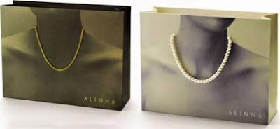
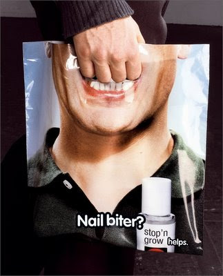
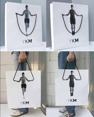
While i was researching for one of my previous modules for last years project brief for Ted Baker, i came across these inspirational designs for shopping bags, which are innovative, extremely eye catching and memorable. 

I really love the designs for these various bags, and i love the way that bags are also a space where manufacturers are creating specialized bags to promote their own products.

The examples above are so creative and fun. If i saw bags like these being carried while i was shopping i would want to buy something from that store. Absolutely great way of promoting and packaging the product.

Nescafé

When i was looking through one of my books, i saw this clever advertisement designed for Nescafe. This is an example where typography on its own is highly effective. The use of the capital 'N' of Nescafe is extremely creative. With the quirky tagline of ' Nothing wakes you up as Nescafe', the N is formed onto its side to form a Z ( a series of Z's is normally applied to design to emphasize sleeping). The Z then gradually rises off its side like you do when you wake up and then it turns into the N of the Nescafe. Even though this Ad is pretty simple, it conveys the point very clearly, that once you have a cup of Nescafe you feel awake. This Ad is simple but very clever and effective.

Ipod design

One design which has inspired me greatly, is the skillfully created ipod "silhouette" campaign. This design is successful as the consumer can identify what the advertisement is for immediately. The vibrant background, contrasted with the black silhouette figure and an ipod shaded in bright white, draws a lot of attention towards the design and meaning behind it. The design of these advertisements present a lifestyle, a lifestyle of the consumer having fun with the ipod. The silhouette works ideally because it makes the figures less identifiable and furthers the consumers belief that they can have the same amount of fun as the figure in the ad is, it also furthers the consumers imagination that the figure could actually be them. The clever way in which the actual ipod in the design is bright white creates emphasis upon the product itself and makes the advertisement immediately recognized by the viewer.

Sunday, 17 August 2008

California Academy Of Sciences


The California Academy of Sciences building in Golden Gate park is planned to be the highest green building rating in the US green building council. This building is nearly finished and is going to be officially opened on September 27th 2008. This unique building represents how the world is turning green through every opportunity it gets in the design world and how environmental issues are the prime concern today. 

I love the way that this spectacular building becomes disguised among the surrounding greenery. The four dome structures on the roof of the building really mimic the the nearby hills of nearby Twin peaks. This design is highly innovative and is visually a pleasure to look at. 

Burj Al Arab- Dubai


The architecture of the Burj Al Arab in Dubai is a highly inspirational building. It looks spectacular and luxurious. It is used exclusively as a  7 star hotel and was successfully designed by Tom Wright. The hotel is 321 m, which makes it the tallest building used as a hotel. Construction began in 1994 and the hotel was officially opened in 1999. The design of the hotel was to resemble the sail of a dhow, a type of Arabian vessel, and as you can see, it certainly does that. The idea of the sail dominating the water makes this building incredibly beautiful, realistic and mind blowing. Not only is the exterior stunning but the interior is also unique, extravagant and fits in superbly with the rest of the concept of design.


Saturday, 16 August 2008

Dead on Arrival

Matt Gibson and Geoff Gaviria created "Dead on Arrival" in 2007 for their final year project at the University of East London. This interactive photographic comic strip has animated choice interfaces which needed to be 'played' for the viewer to continue and progress onto the next chapter of the story (Below is a section where you have to play to proceed with the story).
The music is ideal for the comic story and the overall attention to detail is phenomenal. The colours used are perfect to give the sense of murder and the way that the whole layout feels like a comic book, with the pages turning etc makes it extremely exciting and realistic to use.

To view this website: CLICK HERE

Periscopix


This website inspired me when i saw it. I absolutely adore the style of this website. The cut out collage effect works incredibly and the animation works well with the sound effects. The great thing about this website is that it is different to the usual layout of a website. It is interactive and fun to use. The sound effects and animation creates humor to the website.

A great page on the website is the 'team' page. When you scroll over the members of the team, they become subtly animated with sound effects and make you laugh by the actions they perform. 

To view this website: CLICK HERE

Made by three french students


This was a project produced by three french students at famed graphic design/animation school Supinfocom. The quirky narrative focuses on a mental hospital for animals where the odd selection of animal patients cannot stop making music with anything and everything that comes to hand in the style of STOMP (the broadway percussion show). The 3D animations have been rendered to appear 2D and comic and the combination of an excellent and genuinely funny narrative and the perfect sound production makes this a inspirational short film.

To view this website: CLICK HERE


Carphone Warehouse

Recently i have been inspired by the Carphone warehouse Ad, not only because the animation and creativity behind it is absolutely brilliant, but also because it started off life as piece of UGC. The hitchikers choice video that eventually went on to become viral (2 million plus hits) and attract the attention of Carphone warehouse's marketing executives was originally created as a music video for an electro group called 'minilogue' (Shown below).


I really love the fact that this video that wasn't originally intended to be a viral hit became so big that it actually managed to go mainstream.

The cool abstract drawing style is fun and looks incredible when it is animated.

Sunday, 3 August 2008

Mini Cooper


This Mini 'size' campaign is great. I love the way the public have become part of the ambient media. Mini Cooper wanted to emphasize to the public how much interior space the Mini Cooper has as people perceive it to be very small inside. The Mini Cooper image has been placed at the Zurich, Switzerland train station subway entrance, where people are walking towards and away from it all day. So strategically this ambient media works perfectly situated there, where it appears that the public are piling into the Mini one by one, therefore giving the impression of the Mini Cooper having a huge interior space.  

Banksy

Banksy is known as a pseudo- anonymous British graffiti artist. He transforms miserable, dull walls into pieces of art to be noticed and admired. Some people love his work and others hate it and associate it as a act of vandalism. I think Banksys stencil graffiti is definitely artwork, i love the humour of his pieces and i like the way he works around objects and situations to make the art more suitable. This is evident in the picture above, where there is a water stain on the wall and Banksy has turned it into a urine stain which has appeared due to the guard urinating on the wall.

Tower Hamlets knife crime


This Advert is part of a shock campaign produced by Tower Hamlets council, to voice out the anti knife message to all members of the public. At present, knife crime is at a epidemic level. Figures from the British crime survey showed that a person is the victim of a knife crime every four minutes. 

This TV advert warns the viewer of the dangers of carrying a knife and what effects it could have on you. This clip features a man running through the street, while another man is chasing him. They both get into a fight and the man chasing the victim stabs the young man in neck. While the stabbed victim is on the floor, it is revealed that the attacker is actually the same person. 

This advert is highly effective and works well as part of the shock campaign. The clip is dramatic, energetic and clearly communicates through the dramatic twist at the end of the clip, the dangers of possessing a knife. The phrase at the end with a voice over finishes the advert perfectly with ' Carry a knife and you risk being stabbed by your own blade.' It leaves the public with a strong and forewarning message to never carry a knife.

Saturday, 2 August 2008

Camper Footwear


The current Camper website is a highly interactive, fun and effective website. The graphics, moving imagery and sound used on the website represents what Camper footwear is all about, one that is stylish, funky and trendy.

The home page starts off with a lady walking with a Camper shoe box on her head. When you click on the Camper shoe box lots of balloons appear onto the screen. By clicking individual balloons, a variation of capturing moving imagery appears with suitable sound effects. This website is creative, imaginative and original, and suits its target market.


To view this website: CLICK HERE


Kurt Wenner


Kurt Wenner is a three dimensional street painter. Inspired by anamorphism, Wenner has been able to develop a new artistic approach by creating a new way of painting to give depth to the horizontal surface of the street. 

The image shown above is Kurt Wenners latest three dimensional piece which took him four days to create using chalk and pastels. The millions of pounds spilling out of the vault on the wall of the open space at London Waterloo station stopped many commuters, who were convinced and intrigued by the three dimensional illusion.  

I think Kurt Wenners approach to street painting is fascinating. His work really does create the illusion of three dimensional depth along the open space he works on. His work is extremely realistic and eye-catching and works well in the situation where he performs his art on. His work looks even more impressive when viewed through 3D glasses.