Showing posts with label Design. Show all posts

Tuesday, 30 September 2008

Selfridges- Own brand products


While i researched for a previous project brief for pork pies, i came across this clever packaging for Selfridges. What is so eye-catching and clever about this packaging is that the words are so strong that there is no need for imagery, which a lot of products on this line normally would have. However, through great use of layout, colour and typography these products communicate to the consumer clearly about what the product is and also through using such simple, clean design this packaging portrays itself as rather smart, elegant and unique amongst other similar products. 

Monday, 29 September 2008

OSO Food Wrap advertisement


I really like this clever campaign for OSO Food Wrap. Its got a really lighthearted and fun feel to it and you grow to love the cute characters in each image. With the copy saying " Dont expect your food to look after itself", the imagery works perfect in expressing that message. However what is great about it, is that the product has transformed from a usual boring form of food packaging into a fun, joyful and more desirable product.

This Ad is excellent as it can continue with this concept as there are many other options for this design to go, and many other options for these Food characters to harm themselves accidently.


Hooked-anti smoking Ads

This "Hooked" anti smoking ads campaign is a really effective campaign which really leaves you thinking about it after viewing it. It really does shock you when you look at it, it is somewhat disturbing, but it does make you stop and think about the message of the campaign. 

The posters read " The average smoker needs over five thousand cigarettes a year. Get unhooked". I personally think the imagery works great with the copy and really makes you think twice about smoking.

This Ad did spark nearly 800 complaints about the imagery as it deeply offended a lot of people but surely this is exactly what the campaign was meant to do, it was meant to shock people.

The way that it sparked controversy makes the campaign more appealing to me.


Wednesday, 24 September 2008

Dyson Vacuum cleaner

This product created by James Dyson changed how we all saw Vacuum cleaners. After the DC01 was launched in 1997 we no longer saw the vacuum cleaner as an inefficient, heavy work horse for the household wife, or an eye sore better kept under the stairs! This new development of Vacuum cleaners moved vacuum cleaners into the pride of place in any household male or female, thanks to its technology, efficiency and colourful design.

Sunday, 21 September 2008

Help, I have a headache

A company called 'Help Remedies' has created environmentally friendly packaging to protect there products. The packaging as shown in the example above is organic, pure, uncluttered and 100% compostable. It also has a friendly tone of voice, that will put a smile on your face. The packaging is made out of paper pulp, a unique choice of material used to package these pharma products.

This packaging design has inspired me as it is a complete contrast to the usual nasty materials used and the typical same old graphics used on the packaging of these type of products.


Sunday, 31 August 2008

Shopping bags


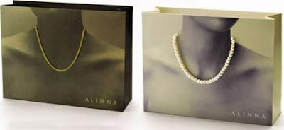
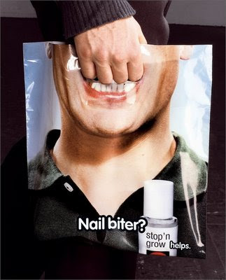
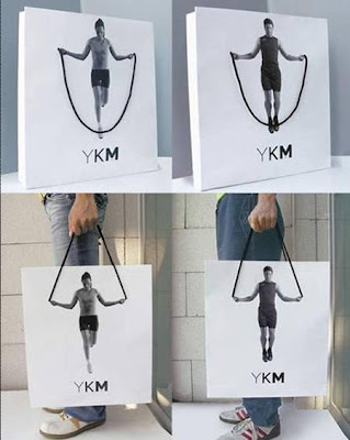
While i was researching for one of my previous modules for last years project brief for Ted Baker, i came across these inspirational designs for shopping bags, which are innovative, extremely eye catching and memorable. 

I really love the designs for these various bags, and i love the way that bags are also a space where manufacturers are creating specialized bags to promote their own products.

The examples above are so creative and fun. If i saw bags like these being carried while i was shopping i would want to buy something from that store. Absolutely great way of promoting and packaging the product.

Nescafé

When i was looking through one of my books, i saw this clever advertisement designed for Nescafe. This is an example where typography on its own is highly effective. The use of the capital 'N' of Nescafe is extremely creative. With the quirky tagline of ' Nothing wakes you up as Nescafe', the N is formed onto its side to form a Z ( a series of Z's is normally applied to design to emphasize sleeping). The Z then gradually rises off its side like you do when you wake up and then it turns into the N of the Nescafe. Even though this Ad is pretty simple, it conveys the point very clearly, that once you have a cup of Nescafe you feel awake. This Ad is simple but very clever and effective.

Ipod design

One design which has inspired me greatly, is the skillfully created ipod "silhouette" campaign. This design is successful as the consumer can identify what the advertisement is for immediately. The vibrant background, contrasted with the black silhouette figure and an ipod shaded in bright white, draws a lot of attention towards the design and meaning behind it. The design of these advertisements present a lifestyle, a lifestyle of the consumer having fun with the ipod. The silhouette works ideally because it makes the figures less identifiable and furthers the consumers belief that they can have the same amount of fun as the figure in the ad is, it also furthers the consumers imagination that the figure could actually be them. The clever way in which the actual ipod in the design is bright white creates emphasis upon the product itself and makes the advertisement immediately recognized by the viewer.

Sunday, 3 August 2008

Mini Cooper


This Mini 'size' campaign is great. I love the way the public have become part of the ambient media. Mini Cooper wanted to emphasize to the public how much interior space the Mini Cooper has as people perceive it to be very small inside. The Mini Cooper image has been placed at the Zurich, Switzerland train station subway entrance, where people are walking towards and away from it all day. So strategically this ambient media works perfectly situated there, where it appears that the public are piling into the Mini one by one, therefore giving the impression of the Mini Cooper having a huge interior space.